Like Us Please

Get This Pop-up Window

https://www.facebook.com/KnwPlc

Pages

PlayStation Mobile

PlayStation Suite renamed to PlayStation Mobile, Sony partnering with HTC to expand its reach.The One X and Galaxy S III are spec-for-spec a match

Acer Iconia Dual Touch Screen Laptop

Acer has worked closely together with Intel to bring about this new Acer Iconia. The Acer Iconia uses a very bright CineCrystal LED-backlit TFT LCD. It also takes advantage of new all-point multi-touch technology

Apple I phones

The i Phone 5 may be water proof Apple is gearing up to launch its next-gen smartphone around summer time.

Showing posts with label Review. Show all posts

Saturday, July 7, 2012

Vodafone Smart II Review


So, if we’re looking at budget Android handsets we have to look at this – the Vodafone Smart II. It’s going on sale for just £70 and is powered by Android 2.3. Inside it’s actually an Alcatel device – the charger and battery gives it all away pretty quickly.
Up front, the Smart II (aka the V860, but you may not ever see it as that) has a 3.2? HVGA screen and comes with a 2GB microSD card. You can have your own custom-designed rear panel too.
Initial thoughts are good. Build quality is pretty good and Alcatel seems to have done a decent job. The camera is a 3.2 megapixel camera with flash. It seems to do an OK job and, with a flash, it’s already got one up on the other budget smartphones we’ve seen across the Coolsmartphone desk.

GPS, WiFi, Bluetooth, all there. The main screen is a 3.2? HVGA and around back there’s a microSD card slot with, in our review unit, a 2GB microSD card.
Outside
So, as I said, first impressions are pretty good. Considering this is £70 (who knows, it could be cheaper by the time you read this) there’s no sense of “bargain basement” to the build quality or the style.

The main screen has a fairly considerable amount of border / bezel but the surrounding silver frame helps to detract from that somewhat.
Under the screen there’s four softkeys – Home, Menu, Back and Search. Holding the “Home” key gets you into your recent apps, holding “Search” on the home screen gets you into the voice control app and from there you can ask “What’s the weather like today” or something similar. You can see the hole for the microphone just under the search icon.

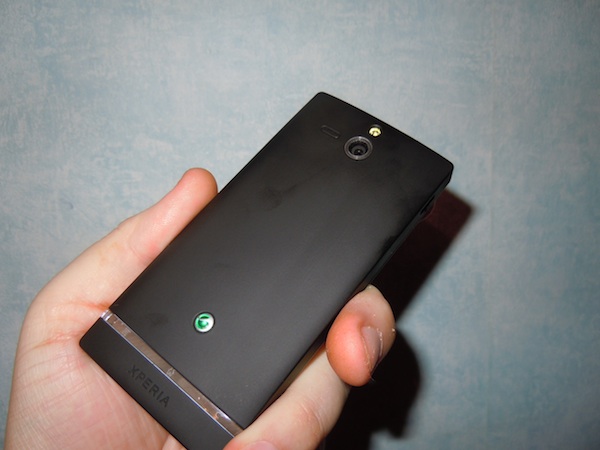
Up top there’s a power key for waking up the device and a 3.5mm audio port for the headphones / hands-free kit and the small catch for removing the rear.

Now, the rear section is a little strange. Pop it off and the outer part comes away – that has the buttons which attach to the inner section. The centre section, which goes around the camera, is separate and comes away second. The flash and 3.2 megapixel camera is also here.

At the bottom is the microUSB charging point which you can use to move data around.


To the right there’s the volume up / down and the dedicated camera key.

Oh and yes, the phone does look a little “thick” in some of these shots. It didn’t feel overly bulbous but was thicker than most smartphones. I liked the fact that calls went straight to voicemail when the phone was flipped over too.

Video overview
Here’s the quick overview video of the Vodafone Smart II…
Camera
OK, I’m gonna start with the camera and it’s… well, it’s passable. The flash might seem like an added bonus but it’s sadly too puny to help with low-light shots and either does nothing to help or, if you’re too close to your subject, makes everything and everyone look washed out and pale.
Shots taken without the flash seemed to have colour issues, with everything looking pale with a grey tint. Video recordings were too low quality to be of any real use.


Here’s a video we’ve filmed on the phone so that your can see the quality for yourself. Please don’t ask me what the hell happened at the end of this video or why it did this, I’ve no idea!
Inside
Although I’ve read reviews criticising the low-res screen, I have to say that I’ve seen worse. The 480×320 screen seems to cope well enough although it was a little weedy in daylight.
Powered by Android it’s going to sync your contacts and calendar with the mighty Google cloud. GMail, POP3 mail and all the Social Media stuff you can shake a stick at. You can even pull your contacts from Facebook if you so desire and there’s the usual thumbnail pics and a huge selection of contact detail, but alas there’s no predictive dial, so calling “Jack” couldn’t be achieved by dialing “5225?. A shame, and a little strange when the predictive dial function is present in texting and emails on the contact field.

While we’re talking about data entry, we should perhaps mention the rather excellent Swype keyboard which is pre-installed. This allows speedy data entry as you finger traces out the word required. There’s a whole load more keyboards too of course, but Swype is one of my faves. It works best in portrait mode as, when the phone is rotated into landscape, most of the screen is consumed with the keyboard and you don’t have much idea what’s going on.

As this is an Android device you’ll be adding in your Google account to register the device. That’ll also open up the Google Play store where you’ll be able to choose from thousand and thousands of games and apps. There’s a massive selection and we found that most of the big hitters like Angry Birds and Cut The Rope worked well.
Vodafone have unpacked their toys and plastered the home screen with a variety of widgets. There’s a weather widget, notification widget and one that’ll deliver the latest Vodafone news and offers to your phone plus a widget to switch WiFi and Bluetooth on or off easily. You can drag and drop programs onto the homescreen and place them where you want, plus folders can be created to keep everything tidy. Backdrops, including “normal” and “moving” (live) wallpapers can be added and all the notification sounds are completely customisable to make the Smart II your own.
For those not like so much “Vodafone-ness”, these can be removed very easily.

The web browser was a tad disappointing. Don’t get me wrong, it rendered pages well and has the very same features of high-end handsets, but for some reason even cached pages seemed to take an age to load and it really struggled with anything but mobile-specific sites. WiFi and 3G seemed to be the same, so I’m guessing it’s either CPU or memory management.
You can double-tap to zoom into reflowed text, which then lets you read paragraphs on one page without having to scroll left and right constantly.
Installed apps include an FM Radio (for which you’ll need some headphones to act as an aerial), the Vodafone “AppSelect” store (which features apps chosen and promoted by Voda), Facebook, a Clock, FileManager, Google Maps, Google Navigation, a Music Shop for buying your tunes, the Google Play Book store, OfficeSuite, Play Movies, Google Talk, Twitter, YouTube and a torch.
We’re not at all sure what was going on with the battery. After incredibly light use we found the phone to be flat after two days, and this was literally browsing a web page and then leaving the phone on a desk over the weekend. Using the phone in anger – just getting GPS to help us navigate into work – resulted in a flat battery as we ate our lunch. No joke, this has to be one of the worst performing batteries we’ve ever seen.

Conclusion
On the outside this phone ticks all the boxes. Alcatel have built a decent, solid and well designed phone which doesn’t look or scream “cheap” in any way. Apps and games ran well, but the low-res video quality, washed-out camera images and slow web browsing left us feeling that we’d spent a little more on a phone.
The limp flash and terrible battery life added to the misery, and I really hope that a software update can go some way to improving things, because at the minute I’d avoid this particular smartphone.


View the original article here

Thursday, July 5, 2012

Sony Xperia U Review

Since Sony took over the headset business of Sony Ericsson recently, it is easy to say they had an uphill struggle getting consumers to part with their money in an industry full of competition from the likes of HTC and Samsung.  Announced back at Mobile World Congress in Barcelona, the Xperia U is the third handset in the new Xperia range following on from the S and the P which are the larger versions of the U.
Now onto the specs….
Android  Gingerbread5 Megapixel CameraHSDPA 14.4mb/sHSUPA 5.76mb/s1Ghz ProcessorBluetooth, WiFi & GPS4GB Storage1320mAh Battery


Looking at the front of the Xperia U, at the top is the light sensor which helps adjust the backlight depending on your lighting conditions at the time, there is also the Sony branding and a front facing VGA camera used for video calls or for taking self portrait pictures
Below that is the 3.5 inch screen which at times feels really small, considering it is the same screen size as the iPhone 4S this was quite surprising but was really noticeable. The screen resolution is 480×854 and apart from the small size, the screen quality is actually quite impressive for a phone at this price.
Below the screen are three touch sensitive buttons like seen on the Xperia S which most of the time get really annoying and often need a few taps to get the phone to respond.  What makes it worse is that the icons telling you which button does what is placed in a transparent strip below which you can’t see normally and when you press a button and this strip lights up it makes it even harder to see the icons.  A very unique design against other non Xperia phones but something which looks like it was not really planned quite right.

On the back you have a 5 megapixel camera (sample images below) with a single LED flash to help in poor lighting conditions. There is also the speakerphone next to the camera. The results from the camera for a 5 megapixel camera are impressive when outdoors and with decent lighting conditions.  Put the Xperia U in poor lighting and the single LED flash does a good job at helping get a better picture but will never be as good as with outdoor lighting.
There is also a macro mode which is very hit and miss with the slightest movement making the photo turn out blurred and out of focus.  This is a problem for a lot of phones though and not just on the Xperia U.

Below the camera at the bottom is the brand logo, and you might recognize it as the same one seen on Sony Ericsson handsets available in the past, this looks like something which survived the Ericsson buyout by Sony.

 The bottom of the phone has the microphone and a hole for a lanyard if you like wearing one of them with your phone.  The lanyard hooks in once you remove the cap at the bottom so it wont fall off.  This cap can be replaced with different colours, which you get a spare cap in the box.  In the device we got in to review it came with a black cap on the bottom and a pink one if we wanted to change…. which we didn’t of course but depending who is looking to buy the Xperia U you might like to swap caps for different days etc…

On the top you have the 3.5mm headset jack for using either the supplied headset or your own one.  The headset supplied was actually quite good when comparing to the normal basic standard you usually get in the box.

On the left hand side there is just the MicroUSB port which is uses for plugging into either the charger for topping up the battery, or for plugging into a computer (PC or MAC) to transfer files using the provided software, this also allows for software upgrades which sometimes need to be done via the cable.


The right side of the Xperia U is the on.off button (also used to put the phone into standby mode), the volume up and down buttons which as with all phones can also be used for changing the profile between normal, silent and vibrate.  These volume buttons also act as the zoom controls when using the camera mode.  Speaking of the camera, thankfully there is also a dedicated camera shutter button on the right side which makes taking pictures really easy, this is a feature many people like to have on their phone.
Final Thoughts
Sony are trying to get their Xperia range into the hands of as many people as possible, and this is why they have three different model phones which have nearly the same design but are aimed at different people.  The Xperia U fits into the low cost but mid range but keeps some important Xperia parts such as the clear strip across the bottom for notifications.  Also with the Xperia U you have the option to replace the bottom cap to have different colours so you can really customise your phone as your own.
My biggest complaint with the Xperia U is that even though it was announced in February this year and only just went on sale recently, it still runs Gingerbread and although it has been promised to get an upgrade to Ice Cream Sandwich, Sony already have a bad reputation at upgrading to the latest software and the Xperia S which went on sale before the U has only just started to get the upgrade.
If you are looking for a small phone but want a good set of specs from a well known company and don’t want to spend a fortune then the Xperia U is worth looking at, but if you are after the latest phone with the most up to date version of Android, Sony might not be for you.
The Xperia U is available right now on Three on contract, free from £20 a month or for £149.99 on PAYG

View the original article here

3CX Mobile Device Manager Review

In recent years we’ve seen a shift in the way that mobile devices are used in the workplace. Previously you may have had a Blackberry or Microsoft Pocket PC dropped on your desk. Things were locked down, secure and managed. Now, with the advent of “Bring Your Own Device”, employees are bringing their own phones and hooking it into Exchange or the local WiFi to access company resources.
Whilst this is great in theory it opens up a can of security worms. Now there’s an estimated 90% of employees using their own technology at work. Without management, this can result in data breaches, so some sort of security needs to be added.
This is where Mobile Device Manager from 3CX comes in. It’s free, there’s no software to worry about and it’s really simple to get going. Put simply, it’s a portal which shows you where registered mobiles are, where they’ve been and what apps are running.
But that’s not all. You can deploy applications to Android phones or groups of Android phones, and you can see what’s installed too. If phones get misplaced you can remotely lock them or wipe corporate data and emails before it all gets in the wrong hands. You can received alerts and send messages to users too.
Getting started is easy, you just grab yourself a free account on their website.
From there it’s just a matter of getting the the app onto each phone you want to manage. It’s easy enough to do, you just search for “3CX”, but you can also take a snap of the QR code that pops up. Once the app is installed you simply enter the account name you provided during the sign-up process and you then authorise it through the web app. Done.
First up, perhaps one of the most useful items – tracking where your phones are. This obviously uses GPS and you’ll notice the GPS signal flashing away on your phone quite often. This can have a small affect on battery life. In the Global Settings there’s an option to alter the “Client Update Frequency” which sets how often to get data, so presumably by tweaking that down you can reduce the GPS activity somewhat.
Note how it’ll also show you the battery level and CPU activity..


I’ve clicked on one of my managed phones and can see the apps that are installed easily – note the buttons which hide internal apps and deploy apps remotely. You can also set a Policy just purely for the device you’re looking at, deploy an APK file or add a file from Google Play. Oh, and of course, you can remove apps that really shouldn’t be on a work phone..


Here’s the settings for the phone and the iPhone MDM options too..

The security aspect is all-important too, so it’s from here that you can block, lock and wipe a phone. Perfect if a device has just been left on a train with those all-important emails and documents…

It connects to Google Maps, so you can use Satellite or Terrain view with Location History. Switch to the Location History tab and you can see where the phone has been in the past – it’ll use network transmitters to get the location too. You can disable tracking and export the whole lot to a CSV file. Click each historical item to see it on the Google Map.

Mobiles can be sorted into groups, so you can message or manage blocks of users easily..

Then you can send them a notification message to let them know what jobs need doing for the day…
You can also send a location, so for example you could give a delivery driver the location of their drop-off or pick-up point easily, even send a URL…

There’s a mass of options within the “Global Settings” screen. Too many to mention here, but you can customize your experience as you see fit.

Still confused? Well, don’t be, we’ve put together a little video showing how easy it is to setup and get going.
Overall, we were more than impressed purely because it was so flippin’ easy to get going and start using it. Sign up and have a go. The security aspect should be of particular interest, especially with so many personal devices flooding into premises. Oh and sure, the GPS can be disabled if the user wants to, but as a way of tracking your fleet, managing your workforce and ensuring compliance it’s a fantastic system.
Link – Mobile Device Manager


View the original article here

Friday, May 25, 2012

Samsung Focus 2 review: Feeling no pressure

The Samsung I667 Focus 2 for AT&T is the third LTE addition to the carrier's impressive Windows Phone lineup. However, in order to avoid clashing with the platform heavyweights - the Nokia Lumia 900 and the HTC Titan II - the Korean offering undercuts both in terms of specifications and price.
As you can probably guess, Samsung's approach towards its latest product to run Microsoft's mobile OS differs significantly than the aspirations of some of major its competitors. The Focus 2 is not meant to sell by the millions - Samsung has its perfectly established Android lineup up to this task. Instead, the white clad Focus 2 aims to offer an entry to the smartphone realm to all those people, who are still in the dark ages of feature phones.


Samsung Focus 2 official photos
Save for the LTE radio on board, there are hardly any surprises regarding the specifications of the Samsung Focus 2. Microsoft's strict Windows Phone hardware requirements, coupled with Samsung's large parts bin have resulted in a device, which despite being new to the market, is hardly unfamiliar.
Here is the full list of key features, which the Samsung Focus 2 has to offer.
Quad-band GSM/GPRS/EDGE supportTri-band 3G with HSDPA 21 Mbps and HSUPA 5.76MbpsCat 3 LTE connectivityWindows Phone 7.5 Mango OS1.4GHzQualcomm MSM8255Snapdragon CPU, Adreno 205 GPU, 512MB of RAM4" 16M-color Super AMOLED display with WVGA resolution (480 x 800 pixels); Gorilla Glass5 megapixel autofocus camera with LED flash and dedicated hardware button Front-facing unit for video calls720p video recording @30fps8GB of built-in storageStandard 3.5mm audio jackStandard microUSB port (charging)Wi-Fi b/g/nStereo Bluetooth 2.1Mobile Office document viewer/editorSocial network integration and cloud servicesBuilt-in GPS receiver, A-GPSStereo FM Radio with RDSComes with a Video call app and other custom Samsung appsNon-expandable storageNo mass storage mode; Zune-only file management and syncNo Bluetooth file transfersNo Flash (nor Silverlight) support in the browserNo DivX/XviD video support (automatic transcoding provided by Zune software)
As you can notice above, the spec sheet of the Samsung Focus 2 is business as usual. You get the standard Windows Phone 7.5 Mango fare, which, on this occasion, is wrapped in a good looking and compact package. Samsung have been careful to differentiate the handset from its competitors by outfitting it with 4" display.
The situation is no different with the list of the smartphone's disadvantages. They are almost entirely related to the limitations of the OS on tap. Surely, the built-in memory could have been more, but, we suspect, that the price tag of the I667 would have suffered as a result. Besides, the potential users of the device are not likely to care about many gigabytes of storage available to them.

 
Samsung I667 Focus 2 live shots
As always, we are going to begin this review with a look at the retail package of the Samsung Focus 2, followed by a design and build quality inspection.
Editorial: You might notice that this review is shorter than usual and doesn't include all of our proprietary tests. The reason is it has been prepared and written far away from our office and test lab. The Samsung Focus 2 for AT&T is a US-only phone and it's unlikely it will be making rounds on the Old Continent. Still, we think we've captured the essence of the phone in the same precise, informative and detailed way that's become our trademark. Enjoy the good read!

View the original article here

Friday, May 18, 2012

'Battleship' Movie Review (2012)


EDITOR'S NOTE: After a four year hiatus, Laremy makes a return guest appearance on RopeofSilicon. Treat him kindly, after all, his first review back is Battleship.
Battleship, as you would probably guess, is a complete nightmare. Devoid of all logic, the film feels exactly like a mash-up composite of every alien invasion movie you've ever watched — only that's too kind. A mash-up has its own art to it (see Girl Talk) whereas Battleship most clearly does not. This is what happens when "product" is made, with the goal of commerce coming far before dialogue, story, logic or any semblance of intelligence. This isn't the hero we wanted or needed, but it's the one they are throwing at us. Make sure you duck!
"Battleship" is a Universal Pictures release, directed by Peter Berg and is rated PG-13 for intense sequences of violence, action and destruction, and for language.
The cast includes Taylor Kitsch, Tom Arnold, Alexander Skarsgard, Rihanna, Hamish Linklater, Brooklyn Decker, Liam Neeson, Josh Pence and Jesse Plemons.
For more information on this film including pictures, trailers and a detailed synopsis choose from the following menu.
Before the film even starts Hasbro has been credited twice, provoking insta-laughter from my screening audience. It's sort of a chest poking gesture that says, "Well, if you take this seriously that's YOUR problem, bub." If Battleship is to be a joke, why is everyone taking it so seriously on-screen? Can you be both ironic about "creation" and also hate your audience for affirming you? Battleship won't answer these questions, heck Battleship won't answer ANY questions, but it will play ACDC over the top of guided missile cruisers attempting to destroy aliens. Regardless, let's plunge on. We're introduced to Alex Hopper (Taylor Kitsch), a 26-year old rebel with a heart of gold. His big bro (Alexander Skarsgard) wants him to shape up his life, but Alex (who's referred to only as "Hopper" even though his brother is also a "Hopper," and an elder, but is somehow not worthy of the single-name/last name nickname) goes through life with a wink and a smile.
At the outset of the film Alex is hitting mightily on Brooklyn Decker, who, truth be told, is lovely in every way possible. Her huge features and golden smile convey at once she's something to be pursued, even while remaining classically unattainable. These opening scenes are handled with — and there's really no another way to say it — a stylish beauty that's befitting of a Peter Berg film. The man has visual and pacing talent, which is why most of what comes next is so dispiriting. To consciously use one's talents for pure mediocrity is a little death, which just might make Battleship his cry for help. But I digress.
We find out Brooklyn is THE ADMIRAL'S DAUGHTER, and why wouldn't she be? Taylor gets himself in trouble, but it's for a girl, so it's OKAY, and then WHOOSH he's in the US NAVY as a Lieutenant. It's interesting that the film paints Kitsch as a ne'er-do-well, but one with a college degree, and one who was promoted past Lieutenant Junior Grade very quickly. To make Kitsch a leader, as he must be for the film to work, he's got to be in a leadership position, even though the first 15 minutes of the film take great pains to show he's an idiot. Question is, will his idiocy "pay off" so he can save the world? Well — have you ever seen a movie?
RIMPAC is set to begin; it's a gathering of 14 Navies from around the world in the largest war games exercise on the planet. "Cool," I can hear you thinking, "we'll get to see 14 Navies team up!" Uh, no you won't. Battleship has problems with the scale of the story already, the whole Aliens vs. the World angle, so they pretty much contain the action to three ships TOTAL. Because how are you going to find time to weave India's Navy into the story when you're busy showing Alex is totally unprepared to lead??!! C'mon guys, let's keep it focused on the things people truly desire, such as cliched and hackneyed hero mythologies.
Alex gets in a fight right before RIMPAC, and he's scheduled to be in big trouble once the weekend is over. Hopefully an opportunity will come up that allows him to redeem himself. Do you think it will?
It's at this point I should take a brief break to acknowledge that Battleship does have many slick moments. Comedy is pervasive, and the techniques used generally work over the opening half of the film. As a comedy, Battleship is fair to middling'. As a tragedy, it's absolute perfection, though more as a metaphor to the state of the industry. As a dramatic actioner, which Battleship so desperately wants to be, it's a complete and utter failure. But still, yes, it has a gloss and sheen that great-grandpa Top Gun would delight in. You will get your shots of The American Flag waving beautifully over awesome music with Rihanna in the background delivering quips. There's a "25 Lighters" cover by ZZ Top that is absolutely perfect for the scene, and it's a prime example of when crowd-sourcing a production makes sense, a solid marriage between hip-hop and rock-funk, setting the mood with verve. So that's something, I suppose.
Speaking of marriage, Decker has coupling on her mind, and she needs Taylor to talk to Poppa Admiral, played by Liam Neeson. There are scenes of Neeson's where you can actually see the check waiting for him juuuuust off-screen, all hail Battleship for using such a talented actor in such pitifully written material. Stop me if you've heard this one, Admiral Neeson isn't so hot on his daughter Brooklyn marrying a stubborn idiot who is "wasting his skills!" Again, if only there was SOME WAY for Kitsch to prove his mettle.
For a moment, we should discuss the aliens, whom you will most likely cheer for against the Earthlings. They're great. They've got these little death wheels that cut up anything in their path, they look like a much bigger version of Ghost Rider's scooter. The aliens have far superior weaponry overall, and for at least the first half hour of "battle" it seems like they might moon walk into the end zone, spiking the ball on our head, and doing that dance where their knees and hands alternate positions. My notes feature a line that reads: "They would win SO HARD." Which is true, and I have no idea why alien invasion films must always go the "David vs. Goliath" route. Why not just make it seem somewhat even? Luckily, these aliens have a fatal flaw, as laid down by the "Gospel According to Signs," which I wouldn't dare spoil for you. The journey is the destination.
Early in the film, Kitsch is kicked in the face during a soccer game by an opponent. Thankfully, due to "movie magic" everyone grows up and the gents come to know and respect each other. Battleship is clearly hoping for a similar result here, but I can't see most of us making it through that initial bloody nose. Even if the first 100 minutes are tolerable, it's near the end that things get completely out of hand. Bonk-bonk, even.
The way in which the final battle is set up is so unbelievably cheesy that one wonders if someone lost a bet to include it in the third act. It drunkenly screams "AMERICA!!" at you, teetering on the edge of consciousness, before finally slipping into (and on) a pool of its own spittle. The inference seems to be that ANY action with explosions, slow-mo, and a hard soundtrack should be enough to captivate you, even as your intellect looks for any logical foothold to contextualize the maelstrom. Brother, you can look all you like, but it's not there.
If you enjoyed this post, help us out and share it on Facebook, Twitter or Google.~ PLEASE NOTE ~
If, in any way, your comment is an attack on the author of this post or a previous commenter, your comment will be deleted without question.Like RopeofSilicon on Facebook
View the original article here

Saturday, May 12, 2012

Review: HTC Legend

Premier partnerSamsung

Excellent UINice battery input mechanismSpeedy browserResponsive keyboardStellar designAverage battery lifeFriendstream and Peep slow to updatePage 1 of 14HTC Legend: Overview, design and feel pt 1After the success of the HTC Hero, the Taiwanese firm is back again with the first of its duo of Android 2.1 phones, the HTC Legend.
Featuring a full aluminium chassis and high-res OLED screen, as well as the latest version of Android from Google, HTC is clearly looking to jostle its way to the front of the best-selling phone queue with the HTC Legend and Desire.
The HTC Legend features a sumptuous unibody aluminium chassis - taking more than a few visual cues from the MacBook range, and refining the lines of the HTC Hero to produce a sleek and very aesthetically pleasing phone.
Despite being one of the first mobile phone releases of the year, the HTC Legend is likely to end 2010 as one of the best looking devices, with the silver aluminium frame sitting very well in the hand.
Also read: 15 best mobile phones in the world todayHowever, there is one slight problem with aluminium chassis - if you leave it in your pocket with keys or coins, it scratches up pretty easily. We're not overly looking forward to having to mention this when we return the review unit...
If you're one of those that like to put a phone in a protective pouch, then there's definitely a case (sorry) for doing so with the HTC Legend.

The 3.2-inch screen has been beefed up as well - while it's the same size and resolution (HVGA) as the one used on the HTC Hero, the bezel has been reduced to give the impression of a wider screen.
And the display itself is now an OLED, rather than LCD, screen. This not only gives incredible colour reproduction, but also displays stunning contrast ratio thanks to not needing a backlight (which also helps with the overall thickness of the phone).
After some reports of the Google Nexus One (also produced by HTC) performing poorly in direct sunlight, that's not the case with the HTC Legend.

As long as you don't have the screen brightness turned down to the lowest setting, it's perfectly easy to use the phone even in sunny climes.
The frame and display aren't the only aesthetic improvements either - the overall layout has been upgraded to make this phone stand out to those browsing prospective handsets in shops.
Page 1 of 14HTC Legend: Overview, design and feel pt 1

Review: LG Chocolate BL20

LG has introduced a more sweetly priced slider phone – the Chocolate BL20 – to try and tempt style-savvy phone buyers not interested in the more feature packed (but higher-priced) Chocolate BL40.
Sporting a similarly sleek design, the LG Chocolate BL20 is the latest update of the original LG Chocolate phone (KG800) that first appeared in mid-2006.
Central to the chic look is a smooth, glossy piano-black casing that features hidden touch-sensitive controls on the front panel that glow red through the casing only when the phone is activated.

It's a more refined look than earlier Chocolates, echoing the BL40's design – although the Chocolate BL20 has fewer high-end features than its touchscreen range-mate.
The new Chocolate BL20 instead offers a more typically mid-priced mobile package – including HSDPA high-speed 3G data connectivity, a 5MP camera, media player functionality and an FM radio. But the real headline on this new phone from LG is certainly style.
Design
The minimalist bodywork of the closed Chocolate BL20 is certainly attractive. Its black bodywork is offset with metallic red trim on top and bottom and on the slide-down number pad, plus some subtle chrome edging.

Measuring 105.9(h) x 50.8(w) x 12.3(d) mm, it's a slimline slider that weighs a reasonable 115g and is nicely balanced in the hand.
However, all that glossy bodywork does mean it can be slippery in cold or damp conditions. Covered in a single plastic sheet, the front panel is also a finger-smudge magnet.
The display is a 2.4-inch QVGA (240 x 320 pixels), 262K-colour LCD, which is bright and zingy enough for most applications. It's not as big as a smartphone-style screen, but is acceptable for this type of mid-range device, especially with no touch control.
LG chocolate bl20
The original Chocolate phone was one of the first to introduce a touch sensitive navigation pad, and the BL20's similar digit-stroke control panel takes up most of the space under the screen.
A central select button surrounded by four direction arrows glows out from behind the black casing when the slider is opened or the phone activated, delightfully fading again when the phone goes into standby mode.
These buttons work conventionally to navigate around menus, albeit requiring light touching rather than pressing. They each also do typical phone shortcuts for calling up features, including text messaging, contacts, ringer profiles and a quick menu grid (you can select up to nine apps or functions for fast-touch access).

Other buttons include two regular softkeys, a button that shows active features as icons on a toolbar, and a widgets key.
This key pulls up five mini apps you can scroll between on screen, wherever you are in the menus. Functions include an alarm clock, memo writer, calendar, favourite contacts list and an online-based weather forecast app you can define for your preferred location.
A light finger glide is all you need to use the controls, like stroking a mobile phone version of a duckling. Dabbing around the menus is similarly effortless, although the sensitivity of the controls to even the merest of touches can cause accuracy issues if you're not handling it carefully.
A stray thumb or finger brushing the pad (generally your own) can accidentally activate a shortcut or the select button.
It's not particularly troublesome in most features but has potential for irritation in some, such as if you accidentally select send while composing a text.
LG has included touch activated volume/zoom controls around the BL20's side, plus a camera key and a screen lock button.

A single microUSB socket on the side takes care of charging, PC data connections and earphones; there's no standard 3.5mm headphone socket on the phone (boo), though an adaptor is provided in-box (slightly quieter boos).
The sprung slider mechanism revealing the number pad feels sufficiently robust. The pad itself provides large keys with plenty of finger room, and despite being flush against the surface are very responsive for fast, accurate texting. The metallic red finish is arresting too.

View the original article here

Friday, May 11, 2012

Review: Acer Liquid S100

Fast processorSlim chassisVisual home screen bookmarksSpeedy internet browsingAwful battery lifeBuggy messaging systemConfusing contacts sortingConstantly crashing Android systemPage 1 of 13Acer Liquid S100: Overview, design and feel
By bringing the fastest Android phone on the planet to market, Acer has good reason to be proud of the Liquid S100. Packing a Qualcomm Snapdragon processor and super hi-res screen, there's a lot to get excited about on this phone.
Acer might be a relative unknown in the mobile world, but that hasn't stopped it making an impression with first the Windows Mobile NeoTouch S200, and by bringing top-end specs and the Android OS, the Liquid S100 will be seen by some as even better.
But one constant problem with Acer phones from the past is that despite bringing some nice parts, they often fail to be anything more than average in general use. So can the Liquid change that?

The phone looks pretty basic out of the box, with a white plastic shell encasing a 3.5-inch screen, but with the large amount of plastic border around the display, it doesn't look anywhere near as big as the iPhone or Samsung H1.
The four touch-sensitive buttons at the bottom offer basic Android navigation, and the hieroglyph look is pretty neat.

The left of the phone houses the power/lock button, and the right has the volume and shutter buttons. Pressing the former is pretty easy one handed, but the chassis creaks a little from time to time.
Weirdly, Acer has decided to go for a miniUSB slot on the Liquid, which seems a little old fashioned. The slot is located on the bottom of the phone, and when charging, a little white battery indicator appears on the top of the chassis, next to the 3.5mm headphone jack, which was a neat touch.

The phone has a single speaker on the back, next to the camera, which is adequate but pumps out basic 'chav on a train' sound quality.
Pulling the battery cover off is a worrying experience – it seems digging your fingernails in at the top and pulling rather hard is the way to do it, and it feels very much like you're going to snap something off.
Overall, the feel of the phone is a little cheap – the plastic of the white chassis and silver buttons makes it feel a little toy-like.
In the box
Acer offers a simple range of accessories in the box – a miniUSB connection lead and separate charger are a nice touch, and the bundled ear phones are decent enough, doubling as a hands-free kit too (although without media control). We're still yet to learn how to use screen protectors on a mobile yet without adding a million bubbles to the screen, but you get a few of these in the box too.

There's also a 2GB microSD card, as well as an adaptor to turn it into a full SD card too. This is pivotal, as the phone won't save any media or photos to the 512MB inbuilt memory for some reason.
Page 1 of 13Acer Liquid S100: Overview, design and feel

Review: Samsung Galaxy Portal i5700

Samsung, the famed Korean jack-of-all-technologies, is having another go at mastering the Android phone scene, after making a bit of a mess of it with last year's original Galaxy.

The i7500 Galaxy was a brave first attempt, but Samsung threw it away, alienating early adopters by not bothering to update the phone past its basic Android 1.5 operating system.

Seriously, there are petitions all over the place. Some men are still very angry about it all.

Samsung galaxy portal

And now, learning from past mistakes, comes the Samsung Galaxy Portal - which looks pretty much identical and features... Android 1.5. Oh well. Let's give it a chance.

First impressions of the Portal are good. Nobody's going to be won over by black plastic in this day of hyper-alloy unibody combat cases and NASA-derived coatings, but at least the Portal feels solid - and the grippy, rubberised-effect of the back cover should minimise dropping/pavement catastrophes.

In fact, the Portal manages to be thicker and generally chunkier than last year's Galaxy, measuring 13.2mm thick compared to last year's model's 11.9mm.

Samsung galaxy portal

The OLED screen of the previous Samsung Galaxy i7500 has been dumped, in favour of reliable old LCD technology - coming in at a thoroughly middle-of-the-road 3.2-inch in size.

It's bright and big enough, and if you haven't yet used a modern smartphone you'll be staggered by the HVGA resolution.

The phone's button layout is a slightly tweaked version of the original Galaxy's control array, which sees acres of the finest black plastic bent into a curved, yet unintelligible collection of icons you might expect to see on the command console of an alien space vessel.

Samsung galaxy portal

You don't get a trackball or optical pad - directional controls are taken care of by a clickable d-pad reminiscent of old video game controllers.

But this is actually fine - text editing is much easier with a reliable, clicky button.

Moving the cursor back three characters to correct a typo in an important, what-time-is-dinner-related text message is much easier when you can simply BASH-BASH-BASH a button three times, rather than fiddle about scrolling a little wheel into position - or even worse, trying to poke the screen at the relevant point.

The screen is also impressive to use - capacitive tech means it's solid and glassy, and it's every bit as occasionally patchy as most other touchscreens out there.

Samsung galaxy portal

You'll soon get used to pressing a bit harder around the edges. Even Apple hasn't mastered that yet with the iPhone.

The standard Android buttons are all present, but there's no explanation of what they do. The 'Menu' button doesn't say 'Menu' - all you get is an icon that looks a bit like a tray with an arrow on it.

The Home button is easy to comprehend thanks to the little house illustration on it, but we can't help but pity some poor old dad who's going to get given one of these as a free upgrade and be left utterly confused by it all.

The handset also feels very 'bottom heavy' - trying to press back or home while holding it in one hand is fiddly, and worse still is the unintelligible approach to button placement - there's thousands of them. Metaphorically.

You get a separate 'lock' button on the top-right edge of the case to wake it up and send it to sleep, a camera button on the bottom-right side, and the volume up/down clicker to the left - picking the Portal up without accidentally pressing something requires forceps and a very steady hand.

Samsung galaxy portal

If only Samsung would bite the bullet and copy HTC's idea (like on the HTC Hero) of having the power buttons also acting as your screen lock - it'd then be possible to do away with at least one plasticky button, shaving fractions of a penny off the manufacturing cost, too.

At least there's a dedicated key for taking photos, which removes the utterly awful concept of operating a camera using a touchscreen button.


View the original article here

Twitter Delicious Facebook Digg Stumbleupon Favorites More